Bible Rangers
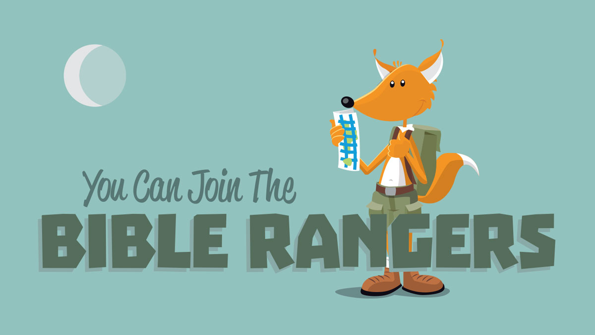
This children’s outreach had a name so long that nobody used it. We needed to come up with something shorter and try to maintain the spirit of the original. After pitching several ideas, the organizers settled on the Bible Rangers as the new name.
The new identity had to work on invitations, posters, t-shirts and other print material. We needed a single-color logo for silk-screens, and a grayscale for photocopies. We used the full-color version most everywhere else. We also thought it important to use the fonts and illustrations that would work well online.
I had two roles in this project: designer and outreach leader. I worked with the other organizers to come up with the concept and had their approval to use the designs. I also got to see how the children and their parents responded to the changes.
The brand identity was well received. It captured the fun, excitement and camaraderie that the old name invoked. It was something that both the team and the kids were happy to get behind.